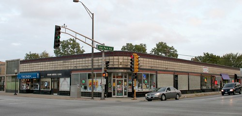
6747 W. Cermak Road, at Oak Park Avenue
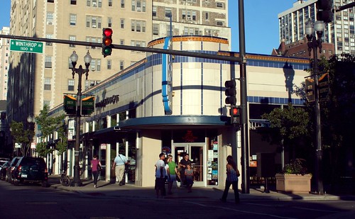
Bryn Mawr, west of Sheridan
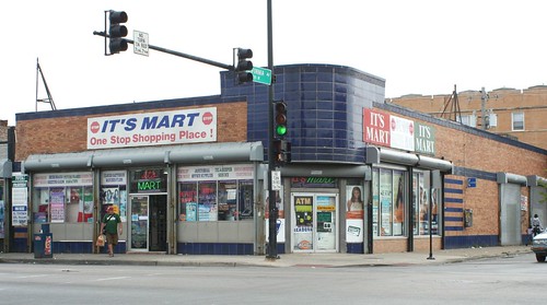
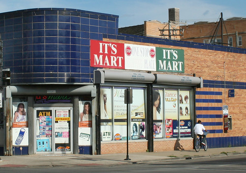
2755 W. 63rd Street at California
This one is the most basic model - rectangular blocks with a glazed, colored face, with horizontal banding lines on top and bottom. This model serves on countless storefronts around the city, both on corners and in the middle of the street wall.
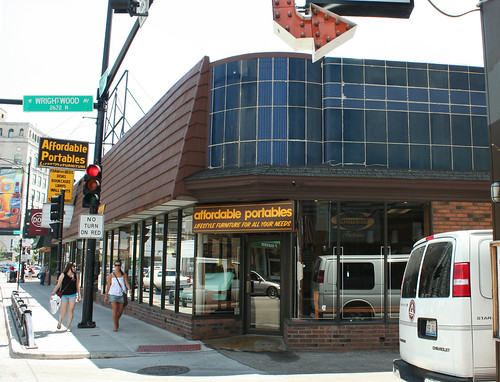
Clark Street - Lakeview. Whatever this building may have once been, it's now buried under an awful asphalt shingle mansard roof, except for this forlorn little corner peaking out at the alley.
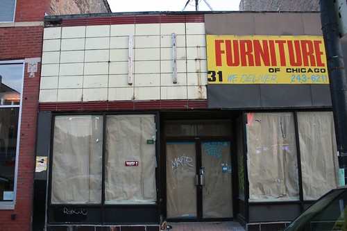
Here on Chicago Avenue, the worst slipcover job ever has partially given way to reveal the stock Streamline facade beneath.
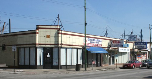
The same idea was used to greater effect on Devon Avenue, where a corner didn't require the entry to be round.
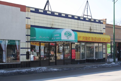
Devon Avenue
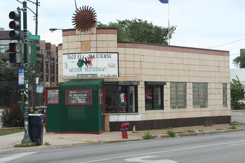
The same model is used on a tiny free-standing building where Grand and Chicago intersect.
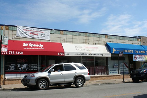
And again in a storefront at 6719 Northwest Highway.
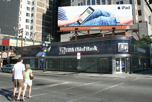
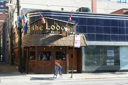
On this North Avenue building, the same effect is achieved with metal panels. This building has had a renovation / add-on that really fights against its host building. Apparently, Streamline just doesn't have the same allure as rustic Swiss Alpine.
You could pull the same effect off in concrete or limestone, too:
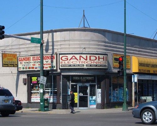
Simple and Streamline weren't the only word in corner commercial chic, however. The varied vagaries of Art Deco offered an array of options for the shopkeeper willing to spend a bit more on his facade, and there are some beautiful examples here and there.
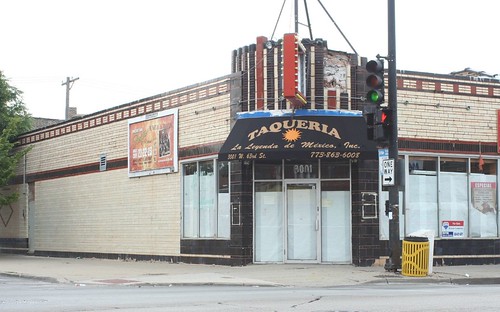
3001 W. 63rd Street
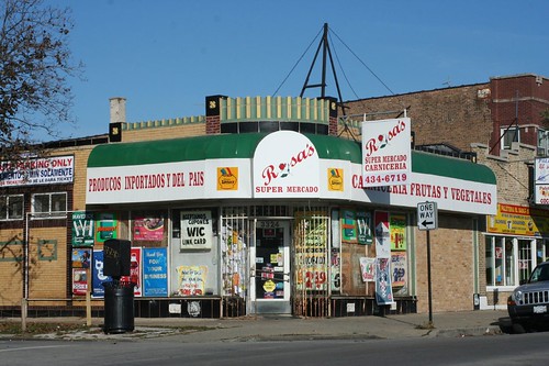
3324 W. 55th Street
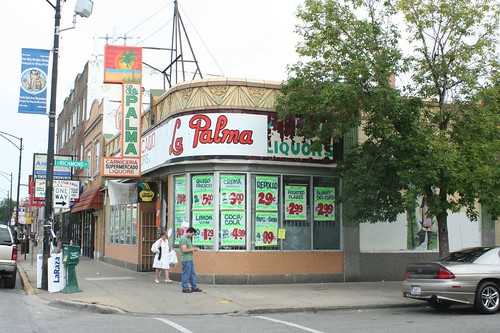
Archer Avenue at Richmond Street
2 comments:
I know for a fact that several of these were built to house the burgeoning chain stores of the 30s and suspect the same is true for most of them. These are the proto-strip malls.
Most of these are simply tragic, especially for a lover of deco/streamline like myself. Fifth/Third Bank did a good job and their signs blend pretty well with the building but - OMG - The Lodge. The owners ought to be arrested.
Post a Comment