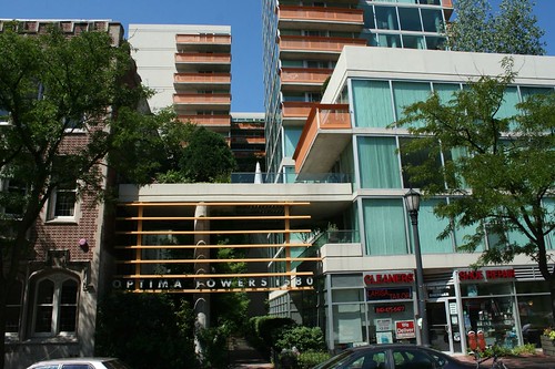
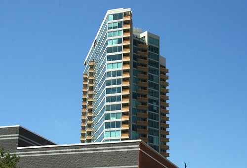
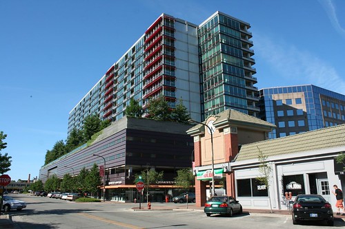
Monday, August 30, 2010

Showing the love for Optima

Evanston has had a trio of sophisticated, contemporary-styled condominiums go up in the last few years, all of them by the Optima design and development company, with architect David Hovey at the helm. They share a number of traits: a Modernist sensibility that is neither over-the-top nor inhumanely cool; a propensity for glass facades; and the ability to slot neatly into urban lots of virtually any size.

Optima Towers

The best, or at least the most interesting for me, is the Optima Towers building.

IMG_4040

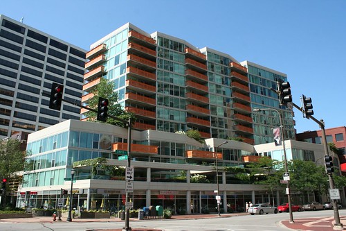
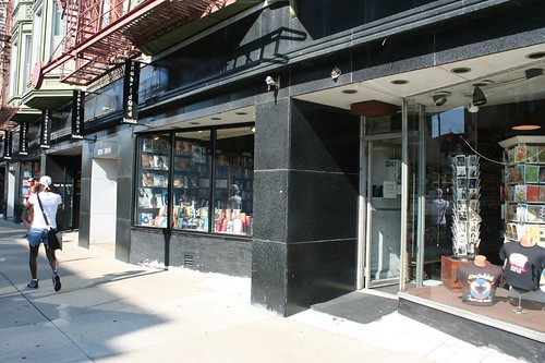
Undulating elevations of blue-tinted glass are broken up into a myriad of forms, with bright orange metal balcony railings further enlivening the view. The staggered profile alone is nice, but what really makes this building sing is the multiple layers of space around its base.

IMG_4297

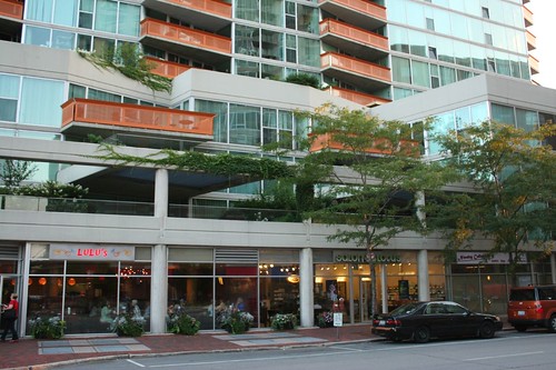
Two stories of balconies and dwelling units flare out over the street, hovering above a "wrapper" of stores. Indoor and outdoor spaces interweave, overlap, and all contribute their activity to the atmosphere of the street. This is a wonderful way to build up a street.

In back of the building, the delightful complexity continues, as a narrow slot of space acts as a garden courtyard, with a waterwall fountain in the back. This serene space offers a layer of separation from the bustle of downtown Evanston.

IMG_4112

Ironically, despite its name, it's the shortest of the three.
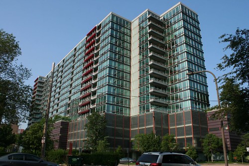
Optima Views

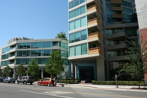
The connection between the Optima Views building and its smaller Towers cousin is obvious. They use exactly the same orange-painted metal balconies, and share a similar aesthetic of carefully angled plans. Optima Views is a much bigger and taller building, however.

IMG_4087a

This broadside view of the south elevation is not the building's best face. As you move around it, however, different views arise. The building changes shape completely, becoming a slender, jagged monument of glass and concrete.

IMG_4102a

IMG_4089a

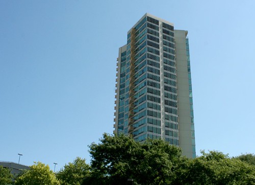
It was this view that made me wonder if Mr. Hovey was perhaps taking some inspiration from Frank Lloyd Wright's Price Tower.

Another point in common with Optima Towers: a slick ability to turn even the most neglected, leftover space into something pleasant and desirable, as with those shadowed corners that became intimate balconies.

IMG_4097

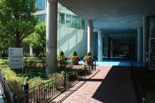
The entryway is more straightforward, given the much larger space available to work with.
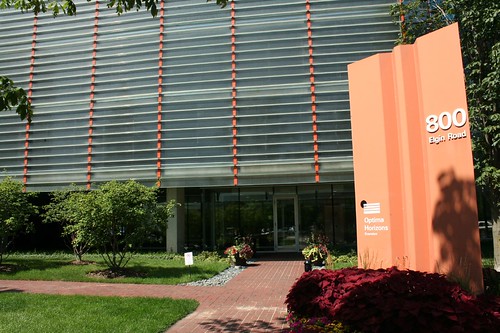
IMG_4098

Optima Horizons

IMG_0094

Optima Horizons is a Herculean block of glass and steel, an entire city block of dwellings lifted into the sky. The multiple levels of parking make its porches a bit detached from the city life about them, but it's hard to argue with the notion of a mini-forest 4 stories up in the air. Like much about these buildings, it's just plain cool.

With the largest and most open site of the three, Optima Views also got the biggest entryway.

IMG_4106

IMG_9589

With so many condos and renovations adding clumsily tacked-on balconies, I have to comment on how much I like the way the Optima buildings handle their outdoor space. Even when the balconies protrude from the building, they never feel like separate, intrusive objects. Quite the contrary: the buildings' compositions would be significantly diminished without them.

DSCF2700

Coming up next time: Optima's magnus opus in Skokie.

Monday, August 23, 2010

Where to get your neon

It's not a sure-fire indicator, but there are very often clues when you're getting close to a neon sign store.

IMG_3578

Elaborate and not-especially-necessary neon displays become more common in the storefront windows, the obvious result of good salesmanship from the neighborhood neon shop - in this case, N. Broadway's Neon Express Signs, in Uptown.

IMG_3570


Quite a few of these little stores pepper the north side of Chicago, and the smarter ones use their store as a form of advertising, leaving it brightly illuminated at night.

P5020246a

The Independent Neon and Signs neon shop stood on Irving Park, right next to the Brown Line, until its building was demolished fairly recently. They've relocated to a new building on the opposite side of the Brown Line, but sadly their replacement digs aren't as exuberantly marked as the old ones.

IMG_9155


Neon Design, Inc. on Ashland puts on a particularly good show inside.

IMG_3522a

IMG_3526


But hands down, the best window display is at The Neon Shop Fishtail on Western Avenue. Not only is their sign the best, they also leave the most signs on at night inside the store. AND they have the most beautiful old storefront, to boot.

IMG_5789

IMG_5793

IMG_5805

IMG_5817

Thursday, August 19, 2010

An Intaglio Extravaganza

Last post I mentioned that designers could occasionally go a bit nuts when they got their hands on a pile of Intaglio blocks, right? Well, there's no better example than this former daycare center, on S. Ashland:

IMG_9302

This building is made of 1960s details, top to bottom - flagstone at the entry, stainless steel paddle door handles with a snazzy font, blue metal panels, blue glazed brick...

IMG_9313


But it's the blocks that put it completely over the top.

IMG_9314

IMG_9320

IMG_9304


And because it just wasn't enough to have vertical stacks of them ringing the entire facade, the north face has a sort of free-form design built into it, made of still more Intaglio glass blocks.

IMG_9318

IMG_1562

This can't have been in the original design. Even for a loopy building like this one, it just doesn't fit. It's the kind of design an architect doodles on his paper during a boring meeting, not the kind of design that actually makes it onto the building! A real estate site offering the building for sale notes that it was originally a bank, so perhaps this was a drive-up window or something that was later infilled?

After years as a community center and daycare, the place has gone vacant in the last year or so. Weeds are growing out of control in the paved lot and the playground. The real estate firm offering it for sale notes that you can occupy the building or redevelop the whole lot. So... enjoy the place while it lasts, because its future is up in the air.

IMG_1566

Monday, August 16, 2010

Intaglio blocks!

IMG_5581

Intaglio glass blocks are the little cousins of the Sculpted Glass Module. Manufacturer Pittsburgh Corning described them in a 1960s catalog as "all-glass units in four distinct patterns featuring a recessed antiqued glass area...outlined with textured gray-colored frit fused into the surface of the glass unit itself" which could be used "to produce dimensional walls with strong textural effects...combining dramatic surface patterns with the richness and beauty of light."

intaglio glass block catalog photo

The catalog photo shows the 6 available models - 2 blank infills and four standard patterns.

And Chicago designers loved 'em. Not quite as much as the Sculptured Glass Modules, but still quite a bit.

IMG_8433

IMG_1068

PB045980

IMG_1637

PA184640


They even came in totally clear versions, apparently. This three flat near Bryn Mawr and California is the only instance I've found so far.

IMG_1621

Their distinctive appearance made them a great advertisement for the local glass block distributors; both the Hardy Glass Block Company and Imperial Glass Block used them in the design of their buildings.

PA054320

Hardy Glass Block


Intaglio blocks could really let a designer go nuts, if he was so inclined.

IMG_9865

IMG_9865a


Or they could be used in a more subdued fashion, as with the Swiss Valley Dairy Products building on western Chicago Avenue:
IMG_1394a

IMG_1396a

IMG_1392a

Intaglios, for whatever reason, aren't as regionally restricted as the glass module blocks; I've seen them in Davenport, Iowa and in Hoboken, New Jersey. And my friends Michael and Lynn located a most impressive example in Trenton, IL.

Thursday, August 12, 2010

Paneled Storefronts Again

Every week on our blog we choose a theme, and then bring you a variety of different buildings on that theme.

This week: revisiting old posts.

Act 2: More 1940s Storefronts.

Sometimes I find that just the very act of posting a blog entry generates more information. Just putting the post out there gets me thinking more about the topic, and maybe I think of a place to research that I missed earlier, or just realize that I need to take a closer look at the building itself. And of course, readers post comments. Sometimes they'll know the answer to a question, or have the architect's name, or - as in this case - they'll know where to look to find more examples of the buildings I've just posted.

Both of these porcelain enamel panel storefronts are near Roscoe Village, and in fact one of them I'd photographed before, and then totally forgotten about it.

IMG_2956
The history of this Belmont Avenue storefront can literally be read right off the facade. Currently it's home to a pub called Hungry Brain. Before that, it housed a laundromat, its applied letters leaving faint outlines. Originally, it had an attached neon sign, whose lettering was not legible.


IMG_2935
Orange Garden has obviously been a Chinese restaurant for a long time, what with the vintage neon sign. Combined with the stainless steel fluting and the porcelain panels, this storefront's a real winner!

IMG_0499

And then, once I started looking for it, I realized that the panels, and the oatmeal texture porcelain enamel in particular, are everywhere. There's a stretch of Broadway where three buildings in a row have paneled storefronts.

IMG_3466

IMG_3462

IMG_3446

IMG_3438


One of my favorite Clark Street facades is made of metal panels:
Bell Auto


And then there's this spectacular multi-store example on S. State Street:
Blue Star Auto

IMG_7745a

With its battered neon sign, flaking painted signs, and 1940s-style blue paneled facade, Blue Star Auto Store is worthy of a whole post.


And just to round out the set, here's one more black Vitrolite facade. Belle Kay on Lincoln Avenue is now home to LuLu's vintage clothing store, and a more appropriate reuse I cannot imagine.

IMG_2945

And "belle" is indeed the word to describe that angular font.

IMG_2946

Vitrolite, sadly, isn't a very good material for meeting the ground. It's a type of glass, and glass snaps and shatters when anything hits it hard enough.

IMG_2947


Finally, a quick update on Erickson Jewelers in Andersonville: A banner announces that it will become a Potbelly's location. The metal lettering has been removed to allow replacement of some of the Vitrolite panels. The neon sign has also been removed, hopefully / presumably for repairs. I'm hoping both elements will be coming back. The Intarwebs remain silent on the matter.

IMG_3415