There's often a lot of groaning and moaning about new construction in the city. Pretty much anything that gets built has someone that hates it. Contemporary design gets decried as "awful glass boxes" or "metal and glass monstrosities" (just try Google-searching either phrase.) Sometimes the criticism has real merit, but I've heard such slurs used against buildings that I thought were excellent.
Meanwhile, this stuff is what you get when you don't encourage contemporary modernism. Faux-historicism is rightly denigrated by architectural purists as "watered down" and wishy-washy - even the ardent opponents of glass-box design must realize that there's something unsatisfying about a brick-skinned condo with a few quoins and keystones tacked on.
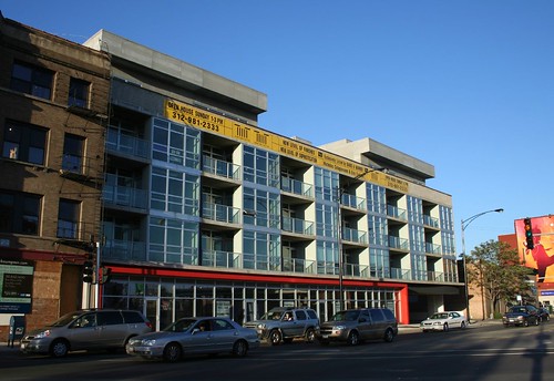
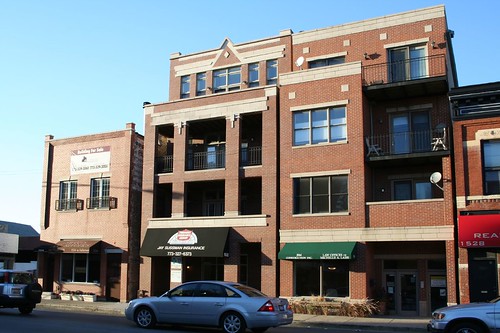
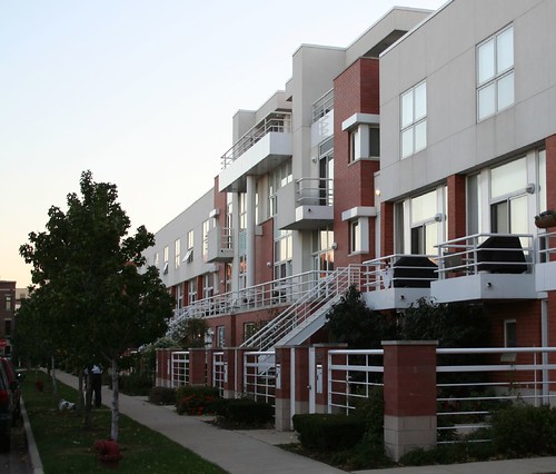
Consider the two designs above - interesting facade compositions, and wonderful recessed porches, but what's up with the random bits of stone? Is it supposed to be a Pullman row house? Are we meant to take the square columns and thinly banded stone as a contemporary Prairie style? Why the red brick? Is there any actual history of this area using red brick for... well... anything?
To do historicism right takes money and it takes serious architectural intention, neither of which are high on the priority list of your typical city developer. And even if you get it right, you're left with an anomaly, a building out of time, a testimony that we live in a era that has failed to produce a great architectural style of its own.
So, let us celebrate those fleeting moments when the architectural spirit does prevail. Chicago is dotted with infill houses in the truly contemporary style, where buildings become grids, and the grids are then pulled apart, cut open, sliced, diced, turned, flipped, snipped, slipped and zipped. This is architectural play - contemporary architectural design at its best. It takes a committed designer to do it well. Chicago is lucky to have so many excellent examples.
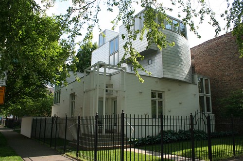
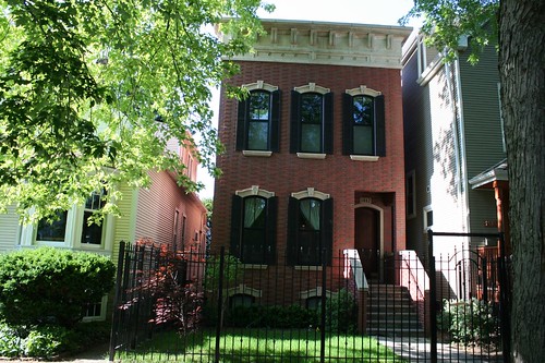
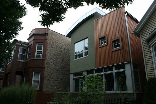
On the bottom, a classic Chicago house, deconstructed. On the top, a Frank Ghery Lite composition.
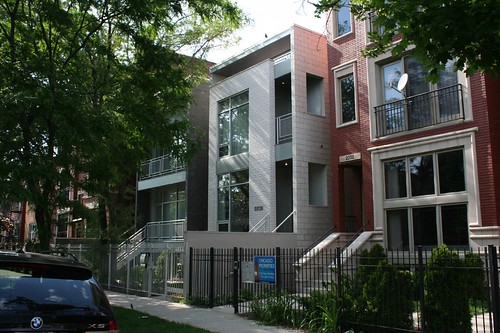
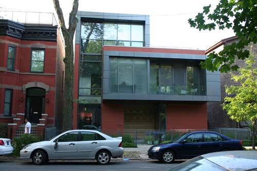
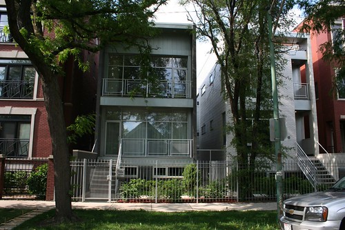
The classic contemporary modern infill home - a flat front facade seems to have slipped loose from its moorings, leaving an open strip of shadow. This move generates a bit of mystery - what's inside that shadow? What materials are beyond there? Can you occupy that space?
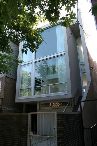
At a glance, a "glass box" - oh, the horror! But just look at how space flows through it. The bedroom is a box within a box, suspended over the living room with its own windows looking out onto the double-height living space that faces the street - and its own curtains to provide privacy when desired. On the right, the staircase seems to rise forever.
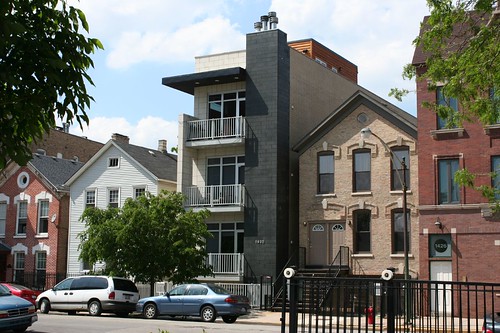
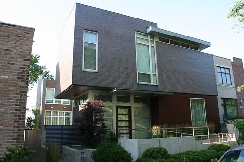
Two floating planes and a solid chimney tower make a plan block box into an engaging composition.
Thickened wall planes have become one of the architect's most potent weapons. Somewhere along the line, architects seem to have gotten over their obsession with making walls thinner and thinner... thus liberating them to make the wall into an actual object, or a thing with physical substance - something to contrast with all that glassy openness.
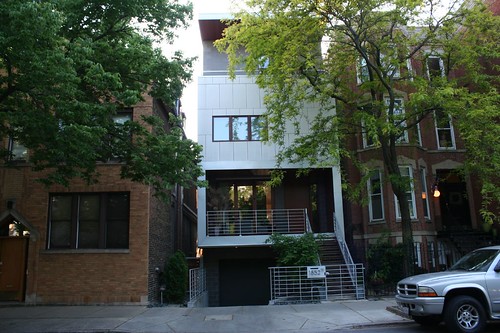
Likewise, the construction of a building as a series of overlapping shapes - interconnected boxes clad in different materials - has become a common form of architectural play.
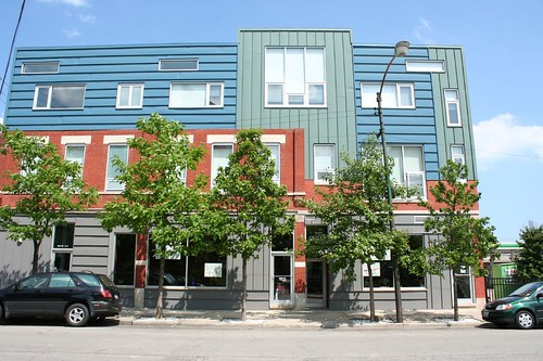
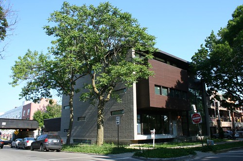
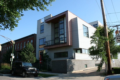
I'm not normally a big fan of standing seam metal panel as a cladding material. Usually it looks cheap and ugly. Architects give it way too much credit in general; when it's hailed as a material of the future, I find the future to seem very bleak indeed. Here, however, it's brought vividly to life with color, contrasting delightfully with the red brick. Another clever move is changing the directions of the seams to match the colors and harmonize with the window orientation.
No comments:
Post a Comment