Near West Side
Little Village
Rogers Park
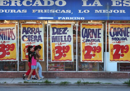
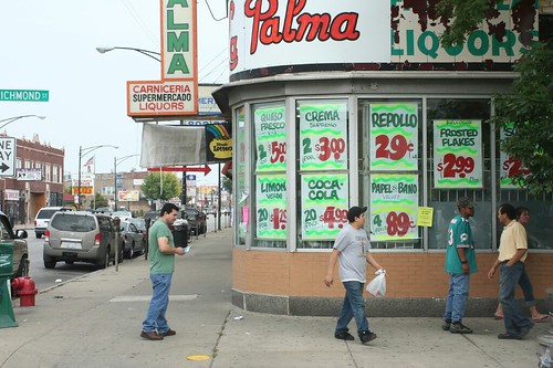
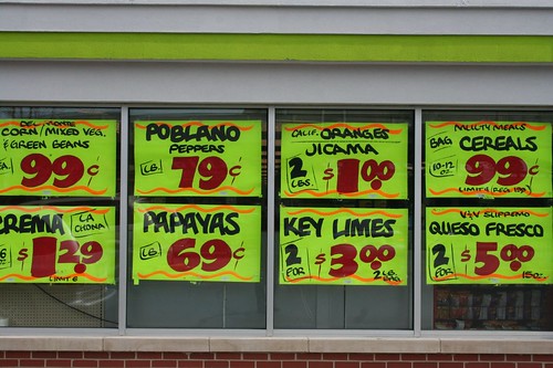
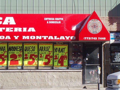
Chicago has tons of Mexican grocers - there are three within a block of my residence alone - and a disproportionate number of them advertise with signs just like these.
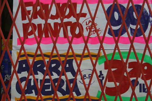
The style is universal: wavy lines top and bottom, in bright neon colors. Huge blocky numbers for the price, in red. Smaller font for the letters, but still in a bouncy, informal, chipper mood.
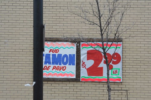
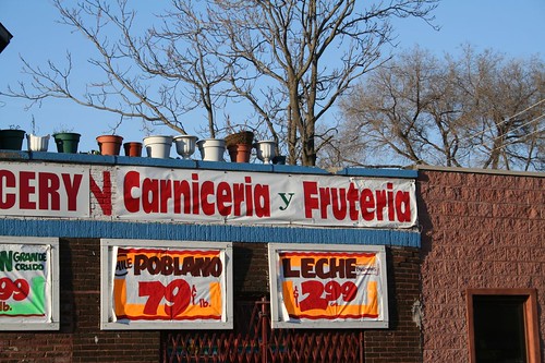
Like the builder's Mid-Century style, it's one of those cases of curious convergence. A quick chat with our local grocer reveals that they get them from varying places, sometimes making them themselves, and sometimes hiring guys to do it. I've seen the stamps of at least two different sign makers on these posters, though most of them remain anonymous.
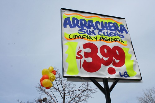
Why are they all the same style? Is it demanded, expected, or simply unexamined? Does it relate to some deep cultural strain, or is it just a thing that is?
4 comments:
These aren't unique to Mexican grocery stores, in my experience, but rather to street-front grocers and butcher shops all over Chicago. Here's a photo of the Greek-owned Pan's Food Center in Oak Park. http://www.oakpark.com/News/Articles/10-28-2008/Pan%27s_grocery_store_plans_to_expand
Here's a blog post about them.
But I do wonder about the fonts. Clearly someone makes a living making these signs.
I'm guessing you meant this post?
http://www.skyscrapercity.com/showthread.php?t=793162
I'll have to keep a closer eye out for where these appear - it's been mostly a Mexican thing from my observations, but that's just me and what I've seen. Thanks for the tip!
This was standard at all groceries and butchers back in the 70s, which is as far back as I can go. I'm sure it goes back much further. Jewel(s), etc, probably got rid of them in an attempt to look clean and "modern."
I always was fascinated by them as a kid. How do they make them?
I've been using these signs in some art projects the past few years, and in my attempts to acquire used signs I talked to a number of shop owners and a few sign makers about it. From what I heard, the sign tradition and even some of the specific font styles are actually an older, white-blue collar Chicago tradition that has in some sense survived or mutated by being embraced by "ethnic" (for lack of a better word) communities. The colors seem to be more vibrant in this more recent phase maybe because of more readily available bright colors. There's a few sign making companies that make a LOT of these, notably R&L signs which in my opinion makes the best.
Post a Comment