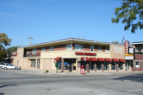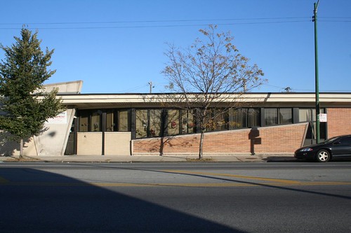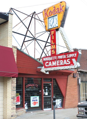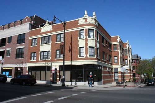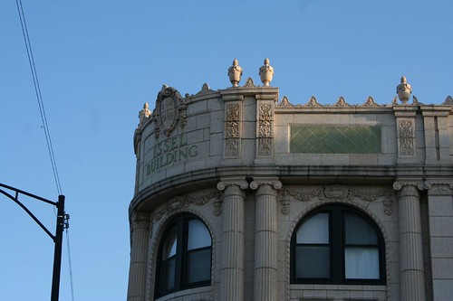
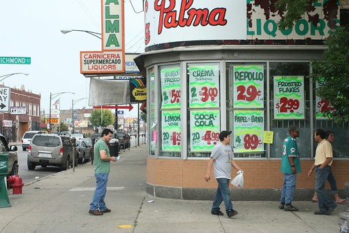
Near West Side
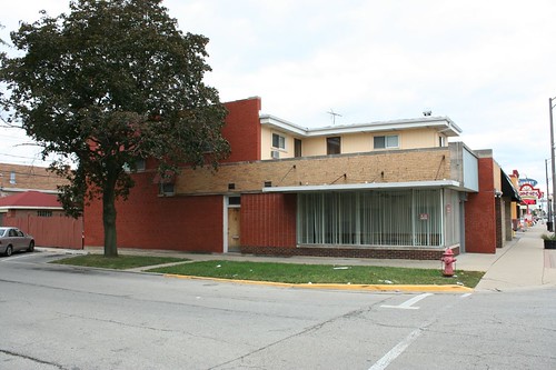
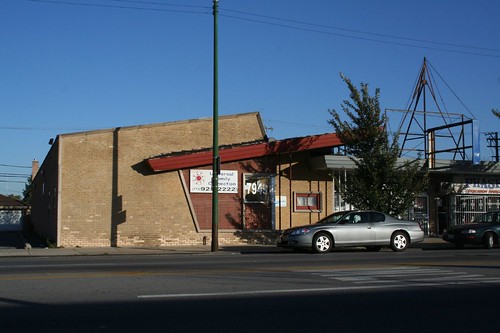
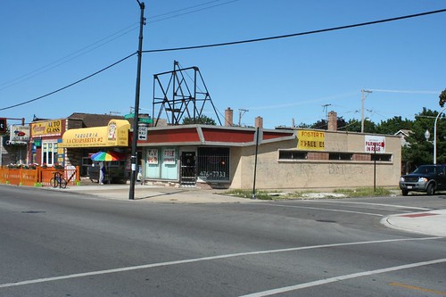
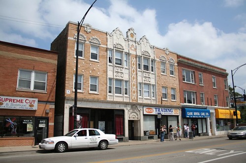
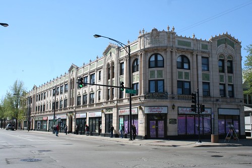
Little Village
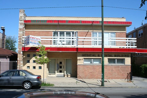
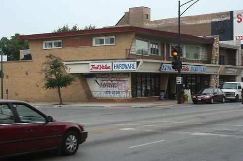
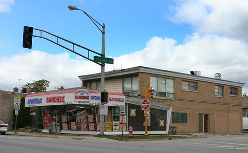
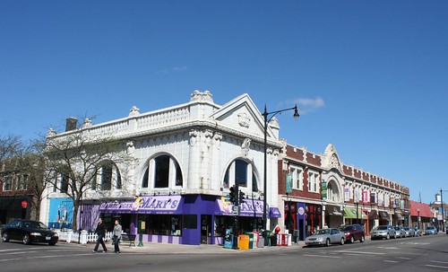
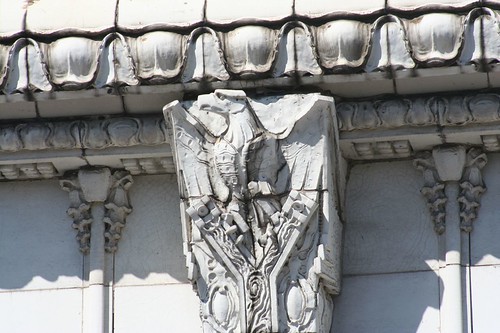
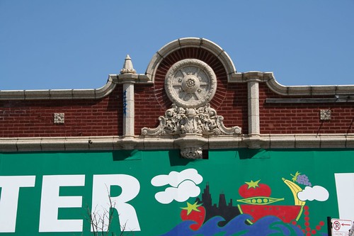
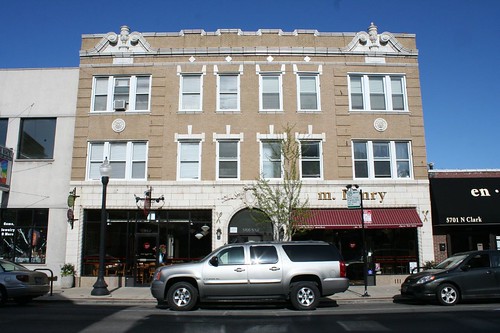
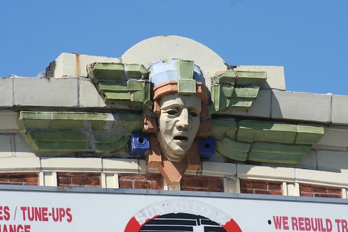
Rogers Park
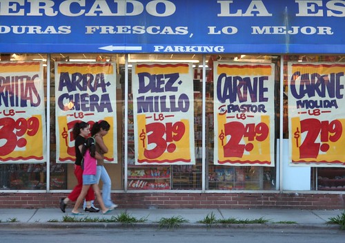
Chicago has tons of Mexican grocers - there are three within a block of my residence alone - and a disproportionate number of them advertise with signs just like these.
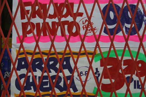
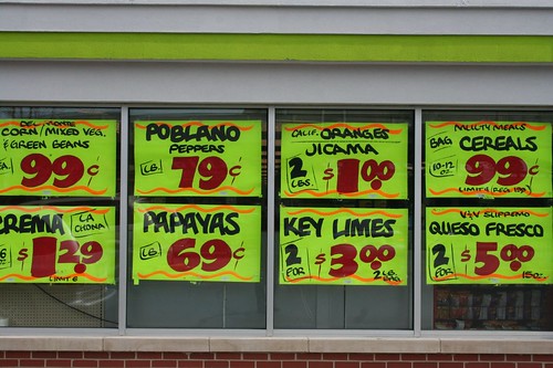
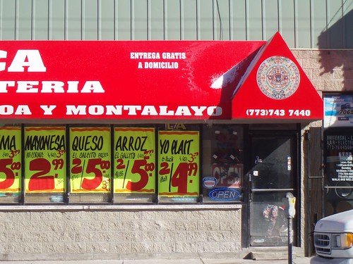
The style is universal: wavy lines top and bottom, in bright neon colors. Huge blocky numbers for the price, in red. Smaller font for the letters, but still in a bouncy, informal, chipper mood.
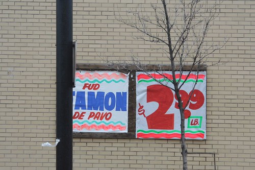
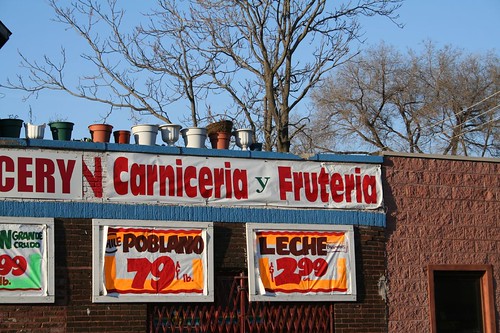
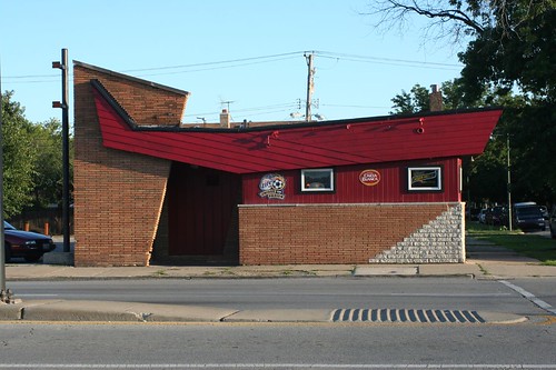
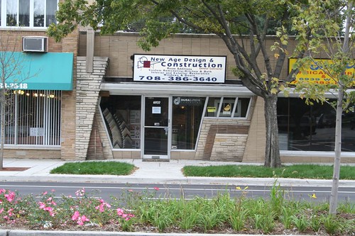
Like the builder's Mid-Century style, it's one of those cases of curious convergence. A quick chat with our local grocer reveals that they get them from varying places, sometimes making them themselves, and sometimes hiring guys to do it. I've seen the stamps of at least two different sign makers on these posters, though most of them remain anonymous.
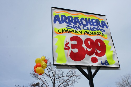
Why are they all the same style? Is it demanded, expected, or simply unexamined? Does it relate to some deep cultural strain, or is it just a thing that is?