Northbrook Public Library
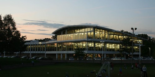
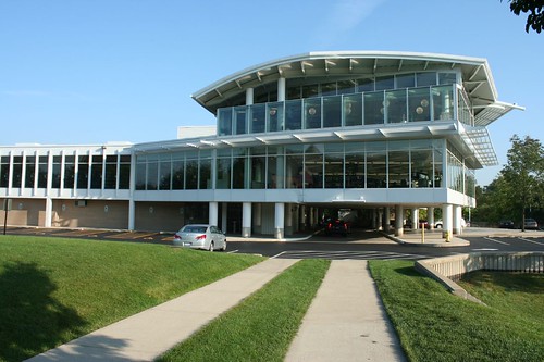
It hovers delightfully by day, and glows like a lantern at night. The Northbrook Public Library is the town's most notable "downtown" building, only a block away from the old village center, adjacent to the Postmodern village hall and overlooking a public park.
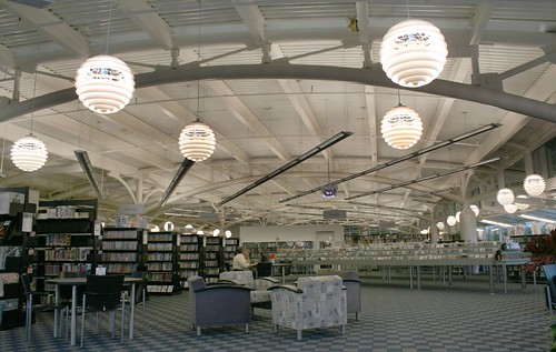
The top floor reading and stacks room is wonderfully light and airy, with the exposed tube steel structure holding up the roof. The curved pipe trusses blossom from their columns like plant life. The whimsical light fixtures are a rebuke to the older section's staid heritage.
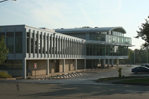
Frye Gillan Molinaro Architects, Ltd. designed this delightful space in 1999. It is an eastward addition to an uninspiring 1960 building, exploding outwards and making you forget all that boring low-budget Miesian repetition. Inside, the two buildings are almost seamlessly joined as one.
It's worth noting at this point that this portion of Northbrook - in and around the "downtown" - is comparatively compact and livable, compared to the surrounding sprawl. The houses are smaller, the lots are smaller, the streets are nicer, and you can walk to the train station, the library, or the small knot of stores. It's a different world from the Northbrook that most people experience, which is on massive arterial roads like Dundee or Lake-Cook.
The Pointe in Highland Park
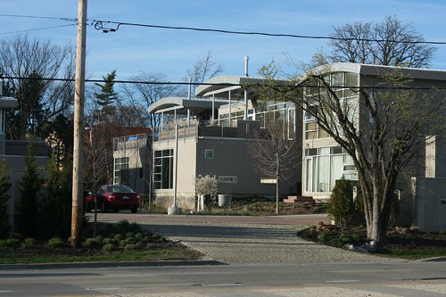
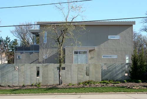
Maybe better known by their street name - Prairie Court - this cluster of Modernist houses stands along Lake-Cook Road, across from Northbrook Court mall (and technically in Highland Park, but it's all about the same thing.) Two of the planned 17 units remain unbuilt - hit by the recession, perhaps - but the remainder stand in neat rows of gleaming glass and precisely finished concrete.
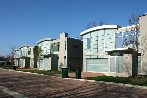
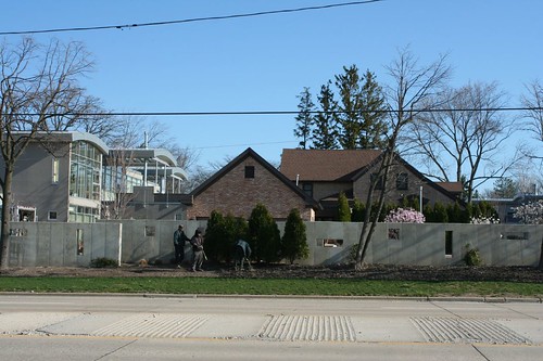
They feature hugely generous glass walls, built-in balconies with projecting roofs, and punched-opening windows in the concrete walls that are echoed by the low screening wall along Lake Cook Road.
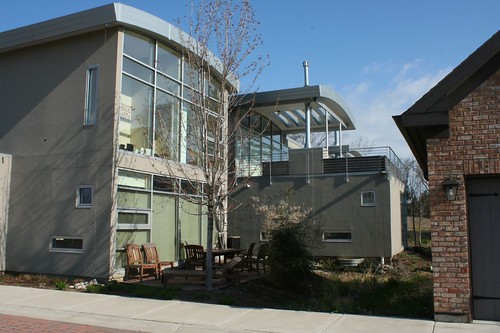
They contain one giant WTF moment: a completely ordinary suburban ranch house that, from all appearances, went up at exactly the same time as all the other houses. Seriously... why would anyone who wanted this house choose to put it here?
3150 Commercial Avenue
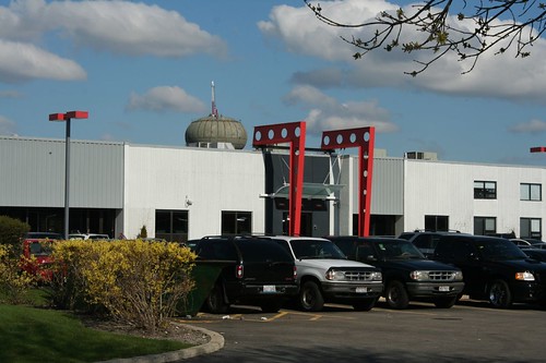
This late-1970s warehouse recently got an attention-getting marker tacked on to its front. Those giant pieces of steel aren't holding up anything but a small glass entry canopy, but they definitely make this faceless tilt-up concrete building a lot more interesting.
In the background, a new water tower is under construction; as of this writing, it's just about completed on the outside.
Greek Feast - by Georgie V
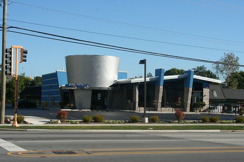
This prominent landmark at the corner of Dundee and Pfingston opened in 2010, designed by architect Brett Karson. The stainless-steel-clad cylinder is a stylized version of a gyro roasting on a spit, while the accompanying blue elements recall the colors of the Greek flag. The shallow-pitched roof, with its two intersecting vertical elements, recalls the 1950s atomic ranch homes which dot the nearby side streets.
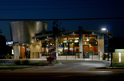
Much to my amusement, the restaurant has been embroiled in parking lot wars with the shabby strip mall surrounding it. In a place like Northbrook, is parking really so difficult to come by?
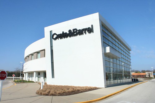
Crate and Barrel

Is it fair to include a national chain in a survey of local buildings? Perhaps so, considering their corporate headquarters is just a few miles down the road. Yes or no, the fact remains that Crate and Barrel puts up rather nice buildings, and this outlot structure at Northbrook Court is typically handsome.
Lipson Alport Glass Associates
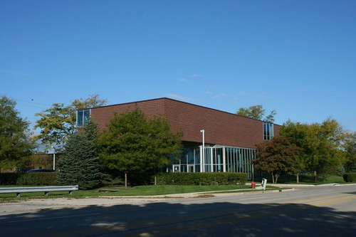
A startling building on Waukegan Boulevard, home to a package-design company. The visible portion is an addition onto a previously-existing warehouse. Opened in 2003. Architect: Valerio DeWalt Train Associates
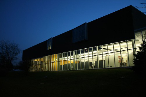
The contrast between the solid second story and the entirely glass ground floor would be interesting enough, but the building goes a couple of steps further. The north end floats off the ground, hovering above low-lying drainage areas; together with the south-end offset, it creates the impression of two overlapping bars that have been knocked off-center.
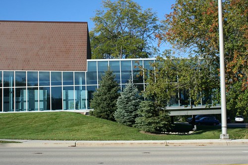
Oh, and the ground floor tilts.
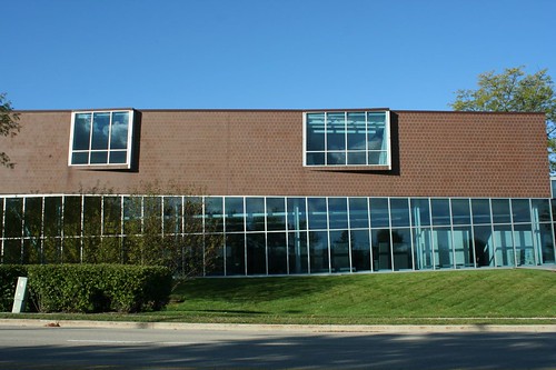
It's not just an illusion; and it is not just the outside. The interior floor, for reasons that Architectural Record left unexplained when they covered this building in May 2004, has a 4-5 degree cant. I cannot imagine how the architect talked the client into this - and I am certain that's how it worked, for no client would request such a thing. "Yeah. We need tilted floors. When I drop a pencil, I wanna see it roll." Clients don't do these things.
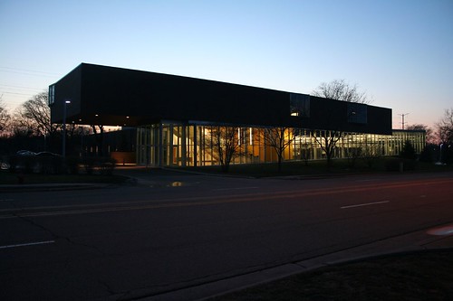
Whatever the reason, it sure is a treat to look at, day or night.
3 comments:
The Greek Feast is pretty cool. : )
The brick house in the middle of Prairie Court is actually a 100 year-old farmhouse that was retained on the property while the modern homes were built around it. There's an unsympathetic rear addition and some goofy dormers added. Unfortunately the detached garage was placed in front, so it may read as a ranch.
I work in the Lipson Alport Glass studio and can shed some light.
While you are correct that the main floor is angled, the floor doesn't ramp and tilt. It compensates with a series of six shallow steps that create different work levels through the wing. The overall effect isn't jarring or odd in the least.
The architect did allow one ramp surface (the walkway near the windows) to apology the effect when viewed from outside, so if you really want to roll your pencils you can :)
Post a Comment