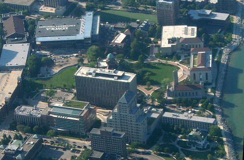
I've seen quite a few campus buildings meet the wrecking ball, mostly at my own alma mater but elsewhere as well. But seldom have I seen a campus demolition greeted with such a quirky, open, mixed bag of emotions as that of Loyola University's Damen Hall.
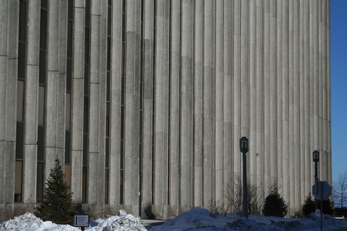
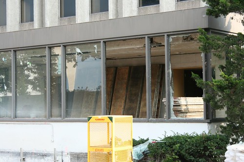
From the layman's perspective, Damen Hall is the quintessential 1960s building - big, bland, banal, ugly, and horrible. Designed with no operable windows, looming massively over everything around it, utterly bereft of ornament - Damen is a hard building to love. Students and faculty likened it to a radiator, a toaster, and a prison, and it's hard to argue with those assessments. Even I, the all-things-Midcentury guy, never bothered to get a full-body shot of the place in life, only snapping a few details that caught my eye. Demolition prep work is well underway, so it's a bit late now.
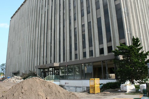
But despite its reputation as a monstrous pile of awfulness, Damen's impending demolition has inspired an outpouring of affectionate commentary from the Univesity community.
While the building was still in use, a 3-minute video tour was produced, a sardonic pastiche of Lifestyles of the Rich and Famous that manages to be informative, fond, wry and hilarious all at once. The University ran a contest to see who should be the last Loyolan to leave the building and lock its doors. The building has its own Facebook page, lamenting its own impending demolition and missing the days when students filled its corridors and strange elevator system.
Much of this is probably just the result of the building as a shared experience, a minor trial that most students had to endure at some point in their career. But I'd like to think that underneath it all, there's some wisps of appreciation for the building's genuine merits, for it did have a few.
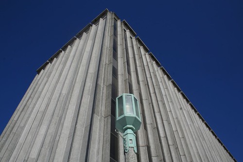
For starters, those marching concrete columns are a powerful statement, and the play of light across them is beautiful. I never saw that massive auditorium, but as shown in the video link above, it's a stunning piece of Midcentury space.
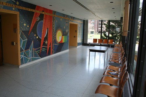
And then there's the front lobby. The lobby and its grand tile mosaic mural was one of my first Midcentury discoveries in Chicago. There wasn't much to the space: the mosaic on one side, two wall of glass on the other, a row of vintage seating that Mies van der Roes would have welcomed on the IIT campus.
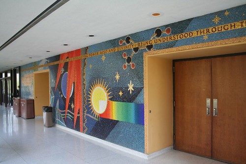
"Wonders of Creation" is a 1966 work designed and executed by Melville Philip Steinfels. The mural is a delight, an abstract plunge through the natural sciences as filtered through a 1960s lens.

The mural is gone now, bare concrete block walls left in its wake. It will be relocated to Loyola's medical campus, in the inner southwest suburb of Maywood.
You can see more details of the mosaic, and read the artist's thoughts on the work, in the Loyola Nursing School's Annual 2008 Report. The main Loyola campus, meanwhile, will be diminished for its loss.
A coda: I'm not too keen on the new building that will go up in Damen's place, either; it's a historicist replica that mockingly apes the oldest buildings on campus, rather than bringing any new ideas to the table (this is marketed as "complimenting" the older buildings.) Designed to be ultra-modern in technology and function, it hides those attributes as though they were badges of shame. Resorting to this sort of neo-historicist pastiche, as so many other universities now do, is a sad admission that our age has nothing of substance to say in built form; all we can do is copy ideas from a hundred years ago, badly.
5 comments:
Oh, not Damen Hall! You have summarized all of its flaws and its good marks well. The minimalist box was a nice counterpoint to Loyola's older buildings and added a layer of mid-century history to the campus.
I usually feel that the mark of whether something should get torn down is whether something better is going up in its place. It seems like it would be difficult for whatever is built new on this site to be worse than Damen - though the mural is cool. And yet, when you show the rendering, I realize that it can, and will in fact, be worse. Historicism has no place in 2010.
I >>love<< that pride mural! How apt for a catholic school. The outside looks like a remnant built from leftover Standard Oil/WTC parts though.
As time goes by, such building as your school gets demolished. It is an open act in preparation for new establishments.
It opened the year before I started. The 9th and 10th floors were still open space with scattered chairs when I graduated. History B with Dr. Knapp. Fr. Peters had his greenhouse full of orchids on the roof and I did my Honors botany project up there. Yeah, it was a firetrap when you think of the escalator and staircase layouts. But I met my best friend for the first time outside Finnegan, waiting for Dr. Gross' lecture. Those photos are a hit in the gut.
The front steps were once rated the 3rd windiest place in Chicago.
Guess I never thought I would outlive it.
Post a Comment