This week: revisiting old posts.
Act 2: More 1940s Storefronts.
Sometimes I find that just the very act of posting a blog entry generates more information. Just putting the post out there gets me thinking more about the topic, and maybe I think of a place to research that I missed earlier, or just realize that I need to take a closer look at the building itself. And of course, readers post comments. Sometimes they'll know the answer to a question, or have the architect's name, or - as in this case - they'll know where to look to find more examples of the buildings I've just posted.
Both of these porcelain enamel panel storefronts are near Roscoe Village, and in fact one of them I'd photographed before, and then totally forgotten about it.
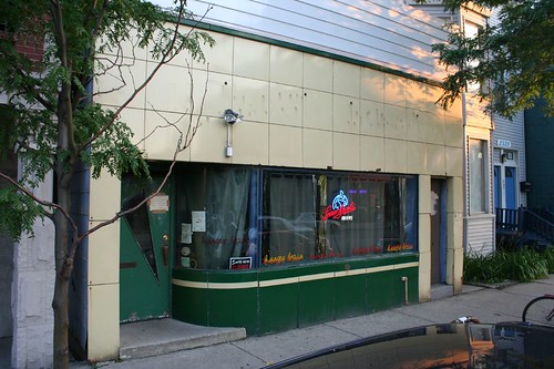
The history of this Belmont Avenue storefront can literally be read right off the facade. Currently it's home to a pub called Hungry Brain. Before that, it housed a laundromat, its applied letters leaving faint outlines. Originally, it had an attached neon sign, whose lettering was not legible.
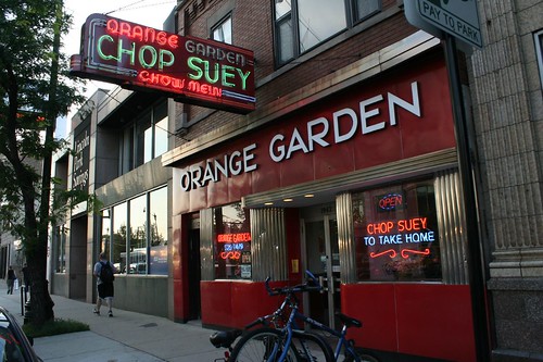
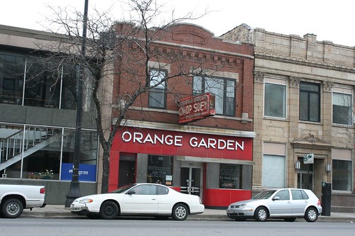
Orange Garden has obviously been a Chinese restaurant for a long time, what with the vintage neon sign. Combined with the stainless steel fluting and the porcelain panels, this storefront's a real winner!
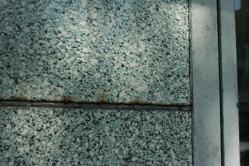
And then, once I started looking for it, I realized that the panels, and the oatmeal texture porcelain enamel in particular, are everywhere. There's a stretch of Broadway where three buildings in a row have paneled storefronts.

One of my favorite Clark Street facades is made of metal panels:
And then there's this spectacular multi-store example on S. State Street:
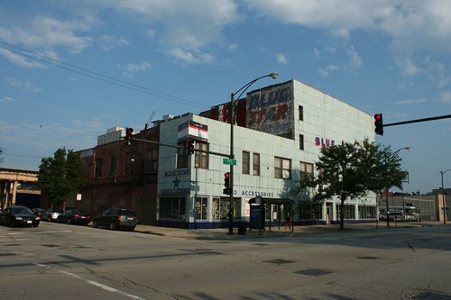
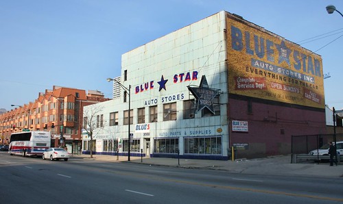
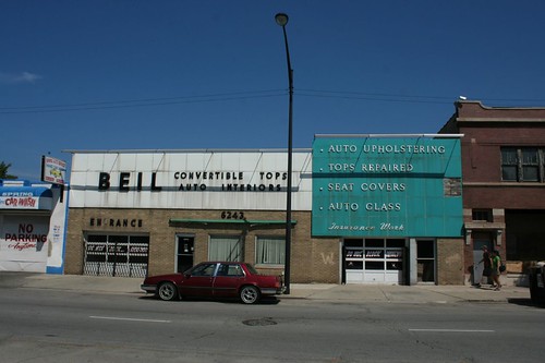
With its battered neon sign, flaking painted signs, and 1940s-style blue paneled facade, Blue Star Auto Store is worthy of a whole post.
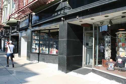
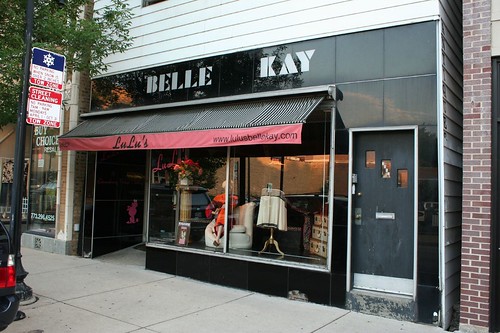
And just to round out the set, here's one more black Vitrolite facade. Belle Kay on Lincoln Avenue is now home to LuLu's vintage clothing store, and a more appropriate reuse I cannot imagine.
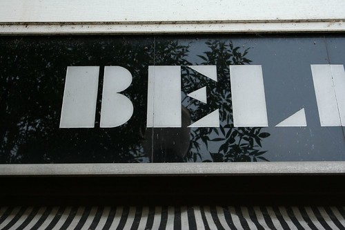
And "belle" is indeed the word to describe that angular font.
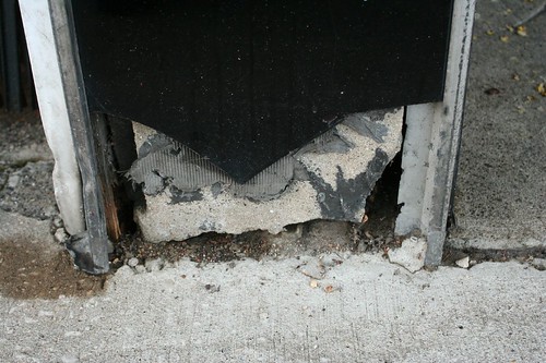
Vitrolite, sadly, isn't a very good material for meeting the ground. It's a type of glass, and glass snaps and shatters when anything hits it hard enough.
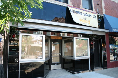
Finally, a quick update on Erickson Jewelers in Andersonville: A banner announces that it will become a Potbelly's location. The metal lettering has been removed to allow replacement of some of the Vitrolite panels. The neon sign has also been removed, hopefully / presumably for repairs. I'm hoping both elements will be coming back. The Intarwebs remain silent on the matter.
4 comments:
I think Hungry Brain was Improv Institute. I also think they were going for a granite look more than 'oatmeal'.
Hah! "Oatmeal" is exactly the word I'd just recently seen used to describe that texture, but I hadn't seen it enough to feel comfortable using it. And agreed - it can look a lot like a stone panel, no doubt at a fraction of the cost. The black one on Broadway is particularly convincing.
Lovely photo ! I really enjoyed reading of your post. You written very good. I liked the neon sign what you shown in photos..
Post a Comment