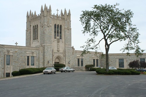
Here, for example, we have Queen of Heaven Mausoleum, begun in 1956, and first opened in spring of 1957. It's a French Gothic styled building. Well, French Gothic Revival. Okay, Neo-French Gothic Revival, since Gothic had already been "revived" as an architectural style about a hundred years earlier. When it was built, World War II was 11 years in the past, televisions were becoming widespread, and Sputnik and the Interstate Highway would be coming down the pike very shortly. Art Deco and Streamline had already come and mostly gone.
I mean, really. Who was building French castles in 1956?
So I wasn't expecting much when I ventured inside the place on a recent Sunday afternoon. Faux Gothic archways would surely get old after a little while, right?
Probably so, but that's not what I found.
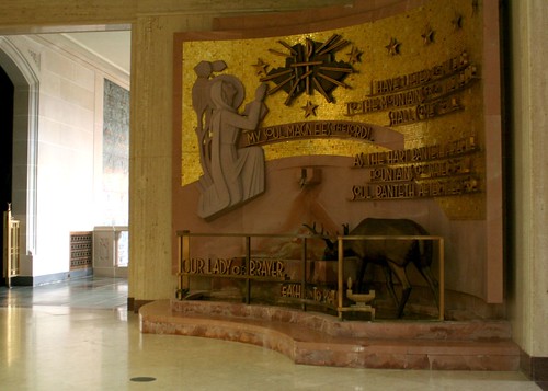
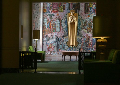
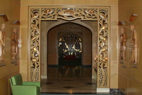
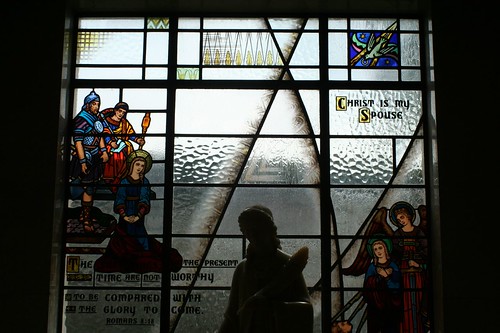
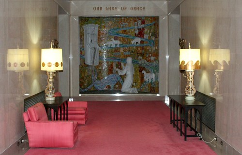
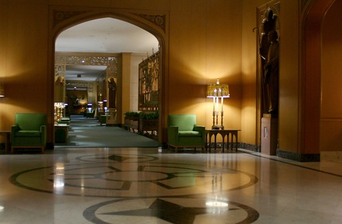
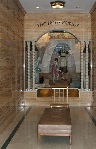
Inside its historicist shell, Queen of Heaven contains a cross-section of contemporary artistic thought circa 1960, and it is glorious indeed. 35 different kinds of marble are used in the interior finishes, and its corridors are lined with a dazzling array of contemporary religious art and iconography. Stained glass, metalwork, wood carving, stone sculpture, paintings, and mosaic tile are integrated throughout the building. No one style dominates, but nearly all of it is touched by the stylized trends of the 1950s.
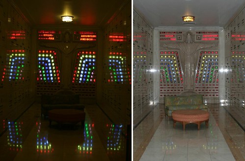
And there is a ton of it. Queen of Heaven, built in three stages from 1956 through 1964, is the largest Catholic mausoleum in the world, and it is vast. One contemporary account puts the three floors of corridors at over a mile in total length, and it's not hard to believe.
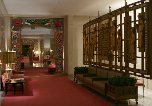
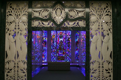
Much of the artwork (if not all) may be attached the Studios of Daprato Statuary Company, with offices in New York and Chicago. Daprato Studios ran an ad in the Chicago Tribune in 1961, proudly proclaiming their role in the vast undertaking. The Archdiocese also advertised the new facility on the same day. Later paintings were completed by Albert Henselmann and Italo George Botti.
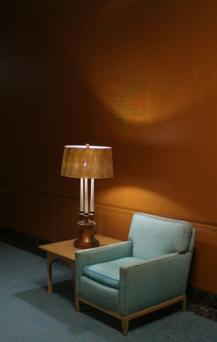
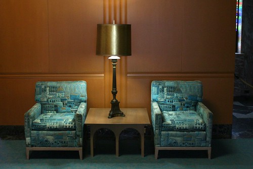
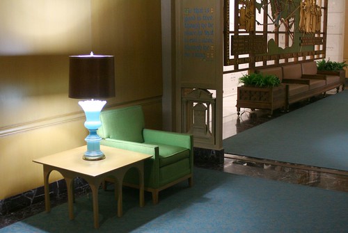
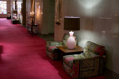
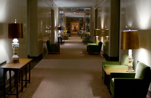
Even the furniture gets in on the act. A series of lamps, mini-couches, armchairs, and end tables cover a miniature spectrum of design ideas. Note the dot-outlined flames on the lampshades above, for example, and the embossed building images on these chairs:
The building itself was designed in stages, with the Gothic central wing and its landmark tower coming first. Nothing in my research attributes the building to a particular firm, but it's a fair bet that Detroit architectural firm Harley, Ellington and Day was responsible, as they did the subsequent west and south wings. The central wing opened in spring of 1957, with room for 7,000 burials, 3 shrines, a main chapel and 4 supplemental chapels. Its $4,000,000 construction cost was covered entirely by advance burial purchases.
The central wing was followed in 1960 by the Queen of Angels wing to the south, designed by Harley, Ellington and Day in a slightly modernized Gothic style (HED was also responsible for the Neo-Formalist Resurrection Mausoleum in nearby Justice, IL.) The large exterior statues on the two side wings were designed by sculptor Ferenc Varga of Detroit, and executed by Gaetano and Alfred Roselli, Italian-born immigrants who worked on the Tribune Tower decades earlier.
A third wing, Queen of All Saints, was designed by recently renamed firm of Harley, Ellington, Cowin & Stirton and completed in 1964, bringing the total capacity of the building to 30,000 interments.
45 years later, it's only 3/4ths full, a testimony to its vast size.
The mausoleum is intended to function as two buildings in one; the dead are contained within their own structure, with its own ventilation system. Despite that, more than a whiff of embalming fluid pervades the air. I spent nearly two hours exploring, and by the time I left I was quite ready to breath fresh air.
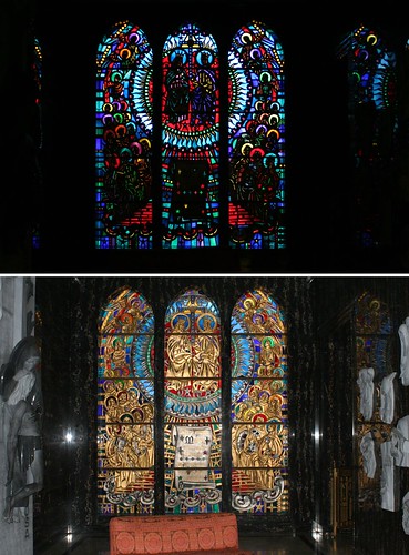
But I left with regret. Queen of Heaven Mausoleum is a treasure trove of Midcentury art and design, some of it among the best and most creative I've seen anywhere. Some of the central pieces, just to cite one example, are these semi-stained glass bas relief sculptures. They appear in key points along the building, such as the main chapel, whose central window looms over the busy intersection of Wolf and Roosevelt. They seem to be executed in a hard painted plastic, with slits, cuts, and notches allowing strategic slits of light through. They are two-sided; the outside of the window gets a fully realized sculpture as well. Unlike many stained glassed designs, there is no front or back to these works. The sculptures are artwork in their own right, even when viewed under full light. In the dim light of the mausoleum, with the daylight streaming through them, they become something else, dark, backlit, haunting, foreboding, and magnificent... like the rest of the mausoleum.
These photos and more may be seen at my Flickr account.
4 comments:
That's... Amazing. Some wonderfully intricate art. But this one... http://www.flickr.com/photos/repowers/3939568907/ ...It kinda weirds me out. It looks like some sort of 70's sci-fi computer prop.
The Jesus Computer.
Very well done. Amazingly I went there yesterday too to take photos for posting this mausoleum on waymarking.com.
I just wanted to say "WOW", and thank you for continuing to post such fascinating tid bits!
When I was doing funeral preplanning about 10 years ago I asked about mausoleum space and was told that the this building is full and the only space available is the new mausoleum in the middle of the cemetery. It's one of those outdoor types. Just a circle with people put in the drawers, all outside
Post a Comment