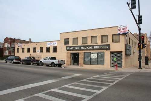
It's everything that's wrong with MidCentury architecture, huh? Bland, dull, boxy, generic, right? Nobody put any thought or care into this one, did they?
Well, don't be too quick to judge. Like many other things in Chicago, you have to look a little closer to find the interesting bits. Sometimes, the whole isn't nearly as interesting as the little fragments that compose it.
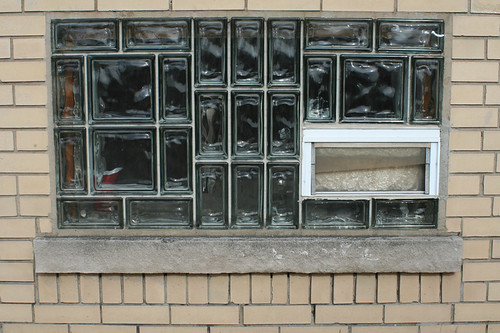
Take the basement windows, for example. Rather than just plain glass or even just plain glass block, someone took the time to work out a little puzzle-piece pattern with two sizes of block to fill in this window. They didn't have to; the standard block would have served just as well. This is purely a decorative gesture, a small act of whimsy.
Likewise, a sign attached to the building combines three different geometric forms into a little floating composition. (yes, three - don't miss the little arrow at the bottom.) I wager that the sign was something a bit more ornate when the building went up.

And the building's limited budget is focused on welcoming the visitor. The sidewalk entrance is decked out with sandy flagstone and a truly eye-popping tile pattern in green, white and gray.
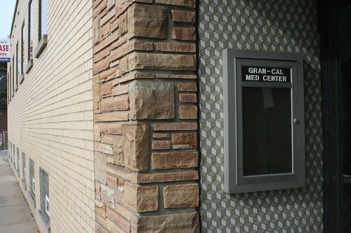
Don't you just want to reach out and touch it?
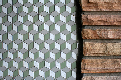
Turns out, this "plain" building even has a little bit of ornament!

Make what you will of the overall effect, but it's hard to deny that earnest care was put into this building's design, like so many other "generic" MidCentury Chicago buildings.
5 comments:
Q*Bert!
I love it- especially the tile.
Hmm, I never noticed the tiles before. Sign, yes. Glass bricks, no. Thanks for turning a boring building into something more excitimg or at least for noticing. Seen it a gazillion times and always thought it was just ugly. Now not so much.
Really great post! What an eye for detail...
A lot, and I mean A LOT, of these small medical office buildings were really well built and detailed. I had to survey some small neighborhood clinics last summer, lemme tell you, I can tell you I was impressed with some of the whiz bang design (if not purely architecture) in them, especially the kitchens for the docs apartments upstairs...
Post a Comment