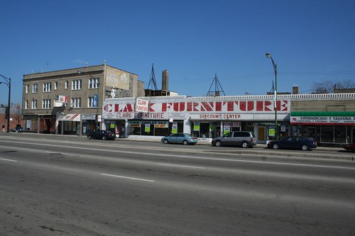
Sunday, June 29, 2008

Don't Fight It

I am perpetually amused by buildings whose owners fight against the building's basic nature. When it happens to great and significant buildings, it's a tragedy, but when it happens to ordinary and common structures, it can be a bemusing commentary on tastes and desires.

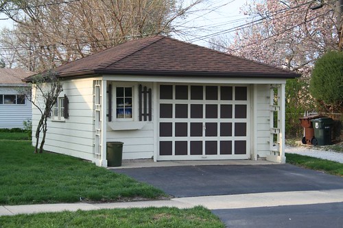
It's an Olde Weste garage

Here we have a suburban Midcentury garage rendered in wood. The car door is a grid of squares. The side screens are a grid of squares. To this simple, clean composition has been appended Olde West "shutters" and a wood flower box. It apparently wasn't enough to be living in the inner suburbs; the trappings of a frontier existence were needed.
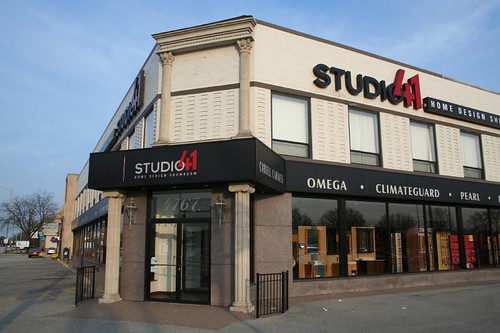
I BELIEVE I AM LOOKING AT THE PARTHENON

Out on Touhy at the highway, Studio 41's interior design store apparently couldn't be seen in a MidCentury commercial building. So, a little Greek Classical makeup was applied, apparently in the hopes that four columns and an architrave would hide the grid of recessed brick, the polished granite panels, the massive storefront windows, and the total lack of any other applied ornament.

Is that a Greek Classical commercial awning I see? Perhaps a Greek Classical internally lit plastic sign, as well?
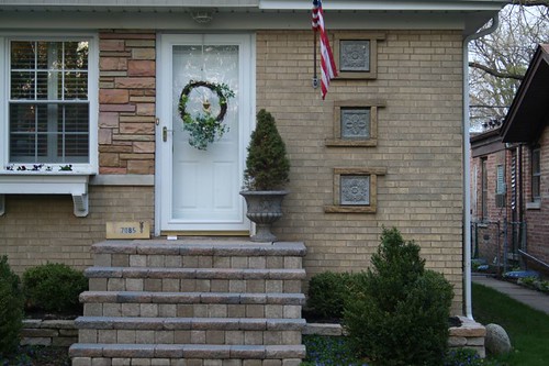
We're living in the country!

Fan that I am of Chicago's MidCentury builder vernacular, I was a bit flabbergasted by this one. Three sculptural panels have been applied over the stock triple glass block openings by the front door. They could be original, especially given how neatly they fit into the openings, but it seems to run counter to the aesthetic. What's definitely not original is that thin little wreath, attempting to bring rustic flavor to a Modernist stew.
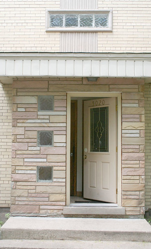
Home Depot special

This is a form of abuse endured by many MidCentury buildings in Chicago. The original wood doors age, get damaged, or just wear out. Rather than repair or refinish them, owners find it easier (or cheaper) to pitch them out and install a low-cost door from Home Depot. Unfortunately, those doors are made for contemporary starter castles out in the far suburbs. They look very out of place alongside the geometric details and clean lines of MidCentury Chicago. Many of the original doors aren't terribly special -- just a square or diamond opening in a flat wood door -- but it damages the building's look, and probably a few spectacular doors have been thrown out because of this trend.
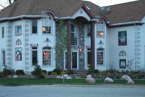
Um

And then there's this. I don't know what it is, where it came from, or what its creators were thinking, but it's certainly unique. It's a suburban-scaled micro-mansion, with two-story columns flanking its miniscule entry porch, but that's just the start of the story. It's got floral wrought metal scrollwork, images of birds and horses and eagles, and (not pictured) a Victorian greenhouse appended to one side. It's got decorative brick patterns around the windows, and quoins at the corners. Quoins!! Round-topped faux-dormers break the roofline, there are flattened-arch-topped windows below, and on the far right (again not pictured) is a full-blown Palladian window.

It seems to be a mish-mash grab bag of about fifty architectural ideas, all thrown in together in the fervent belief that an assembly of beautiful parts would surely result in a beautiful whole. I can't say I agree myself, but it sure is interesting to look at!
Tuesday, June 24, 2008

Trilla Steel Drum Corp.

What the -

Trilla Steel Drum Corporation

- what the heck is it?

Trilla Steel Drum Corporation

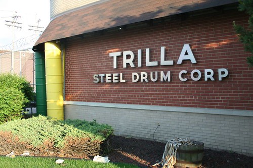
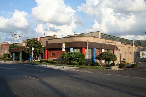
Thus ran my initial reaction upon seeing the building of the Trilla Steel Drum Corporation during a cross-south side bike trip. The company's low-slung factory and office building sits alongside 47th Street in a region of light industry, bars and houses.

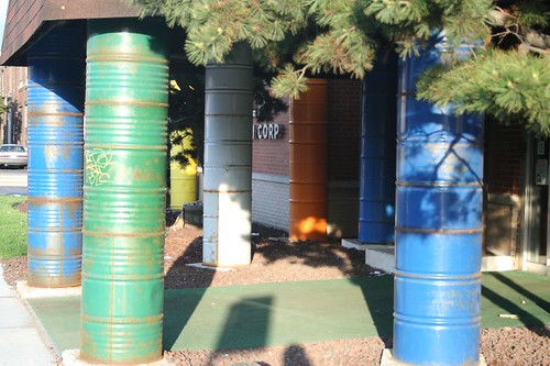
The building's designers made delightful use of the company's signature product, both to enliven the building and to advertise the company's wares. Stacked steel drums serve as decorative pilasters and as actual columns, holding up the roof of the front portico.

Trilla Steel Drum Corporation

Town & Country Liquor

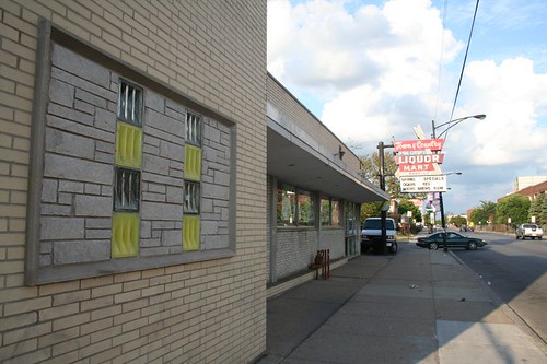
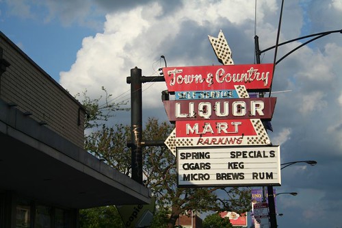
Just across the street, Town & Country Liquor offers both a small batch of Chicago's characteristic incised and glazed glass block, and a handsome Midcentury neon sign.

Town & Country Liquor

Saturday, June 21, 2008

Casa Bonita condominiums

Casa Bonita Condominiums

The U-shaped apartment building is a very standard 1920s Chicago development scheme, allowing a tall building with lots of rental units, while still providing each with plenty of natural light. The resulting courtyard can also become an amenity, providing a slice of nature to the residents.

These buildings are decorated in a wide variety of styles, but far and away the most elaborate one I've found to date is the Casa Bonita, on Ridge Avenue just north of Touhy.

Casa Bonita Condominiums

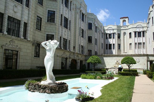
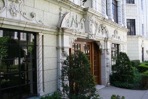
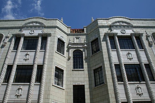
Designed in 1928 by Alexander Capraro and Morris Komar, it's slathered in glazed white terra cotta ornament. Sculpted faces, spiral pilasters, brackets, medallions, and floral decoration are only part of the list.

Casa Bonita Condominiums

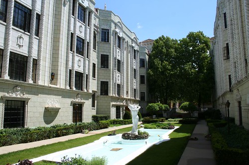
The building is well-maintained today, having been converted to condominiums. Plantings surround a small reflecting pool with a sculpture in the center.

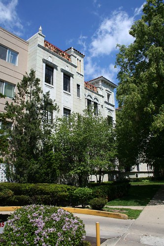
Two trees near the open end of the courtyard ensure that it's almost invisible from Ridge (and unfortunately make photographing the building as a whole impossible.)

Casa Bonita Condominiums

But those trees also provide a screen from the street; a grade change allows the courtyard to be sunken half a flight down from the street, further sheltering it from the busy traffic on Ridge. The entire building as it stands is a testimony to how wonderful controlled outdoor space can be, a literally shining example of the wonderful power of architecture.

Casa Bonita Condominiums

More detail photos may be seen at my Flickr space.

Louis Sullivan bank in Iowa suffers flood damage

A Chicago Tribune blog reports that Louis Sullivan's Peoples Savings Bank in Cedar Rapids, Iowa has sustained an unknown amount of flood damage, with several feet of water entering the bank.

Peoples Savings Bank, Cedar Rapids, Iowa

The bank is one of a series of late-career works by Sullivan, scattered across the Midwest; it is currently a Wells Fargo location. I visited it in 2004, but was unable to go inside as my visit occurred on a weekend. It's less than a block away from the river which runs through the center of town.

At least one Flickrite has a photo of the floodwaters surrounding the bank.

The bank is far from the only architectural victim of the floods; much of the city's old downtown is reported to have sustained damage.

Friday, June 20, 2008

Northerly Island

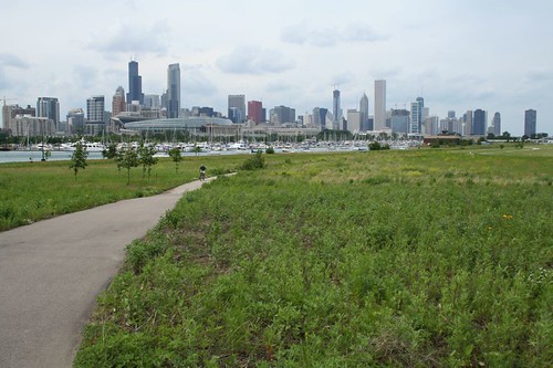
Heckuva view

Northerly Island, a peninsula of land on the lakefront at the south end of downtown Chicago, is the perfect example of something hidden in plain sight.

Tourists flood the nearby Field Museum, and a steady stream make the trek out to Adler Planetarium, at the point from which the peninsula springs. Yet Northerly's sylvan trails, looping among the prairie plants, were virtually deserted when I payed a visit on a summer Saturday afternoon. In all my wanderings through the city, I'd never actually been there till recently, when I decided to seek out the site of the long-vanished airport that I knew had once stood on the lakefront.

The history and function of the peninsula is, likewise, the sort of thing a non-Chicago resident just wouldn't know about. The island hosted Chicago's second World's Fair, in 1933, but all traces of that event are long vanished. A couple of Google searches reveal that the "long-gone" airport, Meigs Field, closed down just a few years ago (in 2003), and under some bizarre and shocking conditions. Mayor Daley, wanting the peninsula for park land, cited bogus concerns about terrorism and apparently ordered work crews to go out in the dead of night and bulldoze a series of Xs into the airport's runways, rendering them nonfunctional. It worked, too; he got his way. The airport ceased operation, once 16 stranded aircraft were cleared out via the taxiway. The city essentially pulled this off with only a slap on the wrist from the FAA. Now there's talk of the island being a venue should Chicago's 2016 Olympics bid go through. How conveeeenient!

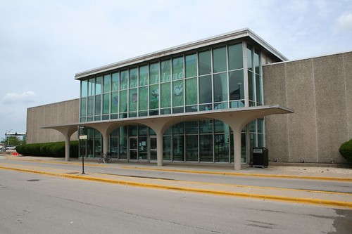
Meigs terminal building

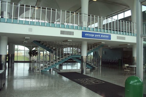
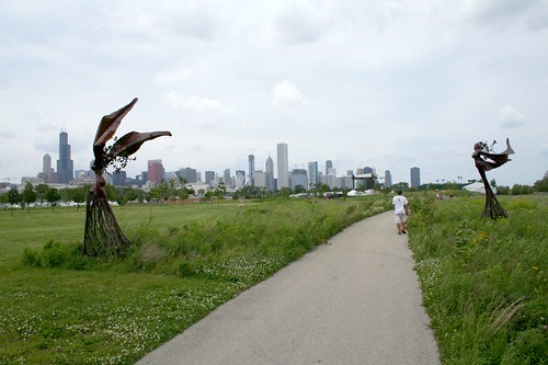
Today, the former airport is a flat space, a replica prairie land (built, ironically enough, on landfill.) A few biking/walking paths loop through it, and a trio of sculptures rise from the grasses. Various structures from the airport remain, including the control tower, various storage fences and sheds, and the terminal building, an unremarkable MidCentury Modern affair of precast concrete panels and glass, enlivened by a nice interior arrangement and a few stock 60s details.

Meigs terminal

Paths and sculpture

The island is nothing stunning or enormously special, but it does offer a nice respite from the hustle of the city, particular as under-utilized as it currently is. The views of the skyline are also unparalleled. If you live downtown, this truly is the place to get away from it all.

Downtown beach

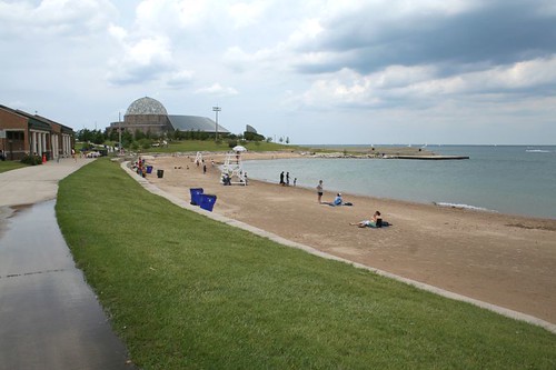
Also hidden away on the peninsula is the 12th Street Beach, a quiet little corner of the lakefront that offers the surreal sight of the Adler Planetarium looming over the sandy beach. It's outlasted the World's Fair, the airport... and might outlast the prairie, if the Olympics come tromping across Northerly Island.

Sunday, June 8, 2008

Music Box Theatre II

I found a moment to stop in to the Music Box Theatre this weekend; the staff graciously allowed me to snap some photos between shows.

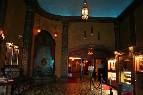
The lobby

The main lobby presages what you'll find within; its upper ceiling is dimly illuminated as if it were the sky at dusk.

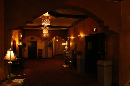
Inner lobby

Past the doors is an inner lobby or lounge, tucked under the balcony. It's a cozy space, with a low ceiling and a few chairs where you can wait for your party. The lighting continues to dim.

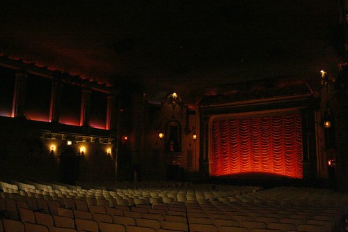
On entering the theater, one's eyes struggle to adjust to the near total darkness.

The mood

The submersion into another world is now complete, particularly if the organ is being played. Slowly, details become visible in the darkness, and you realize what's around you.

Almost sinister

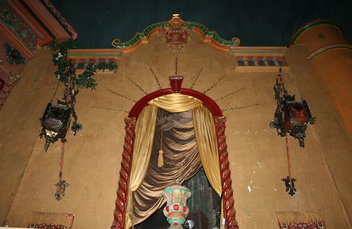
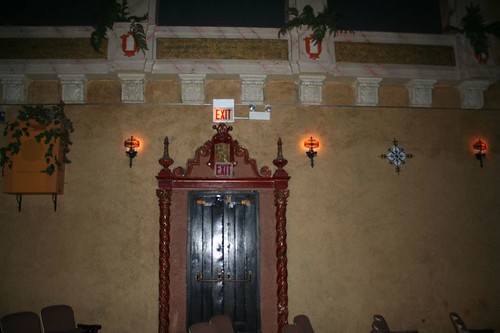
It takes a camera flash to show the profuse ornament of the place, so now I'll break the mood and share a few details from the main auditorium:

Sidewall ornament

Sidewall ornament

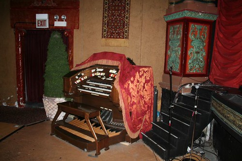
The organ

The darkened lighting allows the theater to pull a few fast ones. Microphones and wiring sit randomly around the stage, invisible to the audience. Some spots on the walls need paint or plaster repairs, but hey, who's gonna notice?

The theater is a lovely experience from start to finish, and I highly recommend catching a movie or three there.

Friday, June 6, 2008

The Music Box Theatre

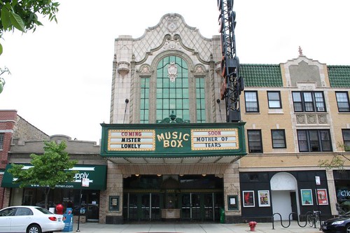
Music Box Theater

We recently caught The Animation Show here at the Music Box Theatre, on Southport Avenue in western Wrigleyville. We had no idea what a treat we were in for.

The Music Box is an old-time atmospheric theater, opened in 1929. Atmospherics had a flat auditorium ceiling painted to resemble the sky, which worked in conjunction with the decoration on the walls to create the illusion of being outside. In the Music Box's case, it's a cloudless evening sky, with tiny pinprick holes lit up to resemble stars (the lights even blink and dim to simulate twinkling.) The auditorium is designed to resemble an Italian palazzo. With the house lights dimmed, the illusion is surprisingly effective.

As if that wasn't enough of a treat, we entered to find that the house organ was playing at full tilt by a very talented organist. The man played for a good ten minutes while we waited for the show to finish; he wrapped up with a flourish to whole-hearted applause from the audience.

The theater is of modest size for its time, seating "only" 800. Unlike many surviving theaters from the period, the main auditorium has never been subdivided into multiple screens; instead a storefront was annexed to create a small second second theater, also in the atmospheric style. The two screens show a wide array of independent, cult and foreign films.

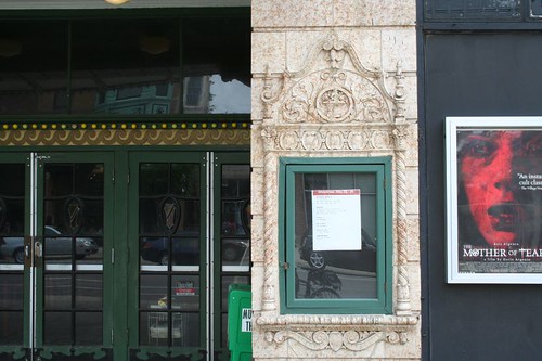
Music Box Theater

The The Music Box Theatre website features original architectural drawings and some colorful history of the building and its staff.

See also: The Music Box at Cinema Treasures.

Monday, June 2, 2008

A sign vanishes

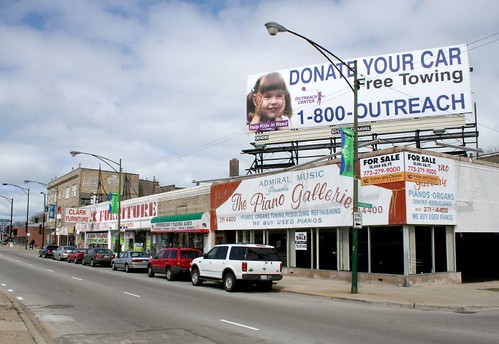
Clark at Hollywood/Ridge

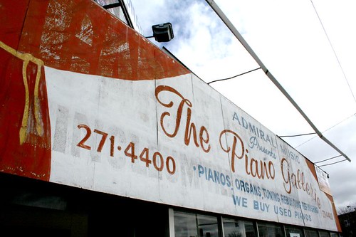
This painted sign, for "The Piano Gallerie", is on a building at the huge and busy intersection of Clark and Hollywood. It was one of those things I didn't quite know what to think of, till it vanished. Only a few weeks after these photos, the sign was painted over in solid white.

The Piano Gallerie

I rather miss it. There was a charm to its homespun, minimal budget attempt at elegance.

Clark Furniture

Another distinctive sign may be in danger next door, as Clark Furniture has gigantic "Going Out of Business" signs in the windows. (I've heard reports that they've been "going out of business" for months or years.)

Edit, 7 June 2007: They did indeed close this week, and the sign has been painted over. Bugger all!