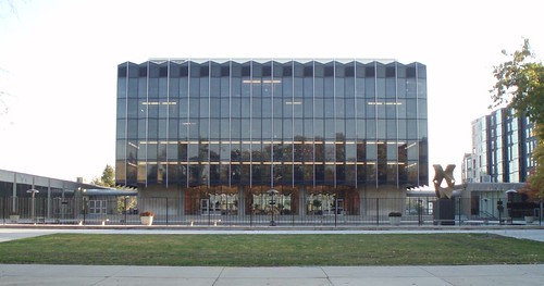
It's not often you just stumble across an Eero Saarinen building, especially one just coming out of an incredibly thoughtful renovation. Yet that's exactly what happened to me recently on a stroll across University of Chicago's campus. I noticed and was immediately captivated by the Laird Bell Law Quadrangle.
Saarinen, by all accounts, was a terrible Modernist. People liked his buildings, for starters; they have creativity, individuality, and flair. Furthermore, this building actually acknowledges all that dreadful historicist stuff that surrounds it; instead of having the building shining like a crown upon the very hilltop in splendid isolation, Saarinen intended the library's profile to reflect the verticality of the campus's NeoGothic buildings, and even uses one of those NeoGothic walls as part of the quadrangle. Shameful! Quick, somebody take away his Modernist card!
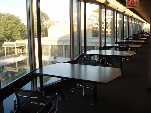
The library is, of course, spectacular. Its Modern interpretation of a castelated roofline (and arcade) are thin facades, but the in-out rhythm of the bays is matched by the floorplates behind them. And when you get inside, you find that the study spaces actually follow that rhythm, turning a long narrow corridor into a space that dances. And look at those tables!! They're custom-cut to match the angles of the building!
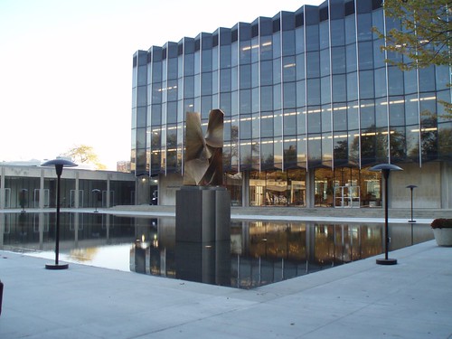
But I'm getting ahead of myself. One arrives at the D'Angelo Law Library through a lovely minimalist courtyard, occupied by a millimeters-deep reflecting pool. Entering the building is a bit of a challenge; the very obvious, invitingly-placed front doors are, of course, locked up tight. Modern institutions have an incredible talent for taking wonderful main entrances and bolting them shut, then forcing visitors to wander around to some obscure and uninspiring side entrance, and so it is here. It doesn't help that small signs on the front door actually send people to the wrong set of doors. Whoops.
But once you finally get in...
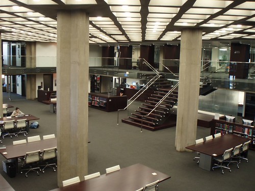
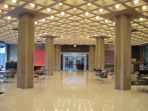
...the interior is grand. The building makes handsome use of its waffle slab floor plates, placing a light fixture in each one. This gesture creates a glowing grid, making a decorative asset out of something that's all too often just left hanging there unadorned.
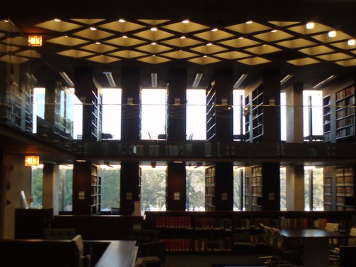
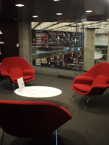
The main reading room is a masterpiece, cool and sophisticated, spotted with decorative furniture. The main staircase descends smoothly from the mezzanine level, as much sculpture as fixture. The renovation has placed fittingly-styled furniture in strategic locations; these splashes of bright color contrast with the cool tones of the building itself.
The cool interior is also offset by the generous amounts of natural light flooding the study areas along the building's perimeters. With walls of glass, students practically float among the trees as they pour over their books.
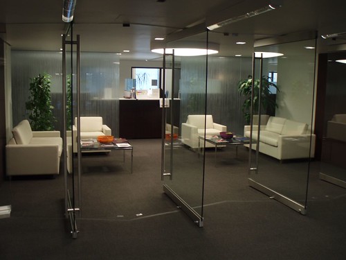
In the wake of a masterful renovation by OWP/P Architects, only a few subtle clues differentiate the old from the new. The stainless steel standoffs supporting many panes of interior glass, for example, are not something that was in common use 50 years ago. Yet their cool simplicity fits perfectly with the building's aesthetic. Some quick online digging reveals the vast extent of the renovation, which is a shock considering the final product. Clearly the architects understood and cherished Saarinen's original intent -- it shows in the stunning beauty of the final product.
Links:
- Wall Street Journal
6 comments:
The renovation of the classrooms (also by Saarinen) is a terrific piece of work, too, if a bit more mundane. The buildings were hideously awful a few years ago, back when I had mock trial practice there, but they're pretty delightful inside now.
Love the womb chairs.
God, I am so jealous. The library I work in looks NOTHING like that.
My uncle worked here when it was brand spanking new - one of the best 60's buildings on the Midway. The University tore down the other Saarinen building to build the new business school.
I'll have to go check it out, we used to go see movies here when I was a kid.
I pass by this place every day, without giving it a second thought.
You really broke things down for me.
This is one awesome building. It's good to see such an attractive building amongst the decidedly average constructions that go up nowadays
Post a Comment